INTRODUCTION
OVERVIEW
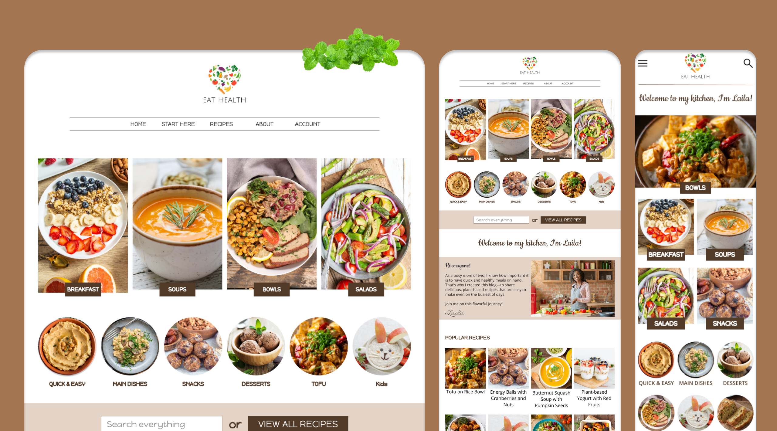
Eat Health is your comprehensive guide to delicious and nutritious plant-based eating. Offering quick and easy recipes for every meal, all made with whole, nutrient-dense ingredients. From breakfast to dinner, there's a variety of tasty and healthy options to nourish your body and mind, even on the busiest of nights.
CHALLENGE
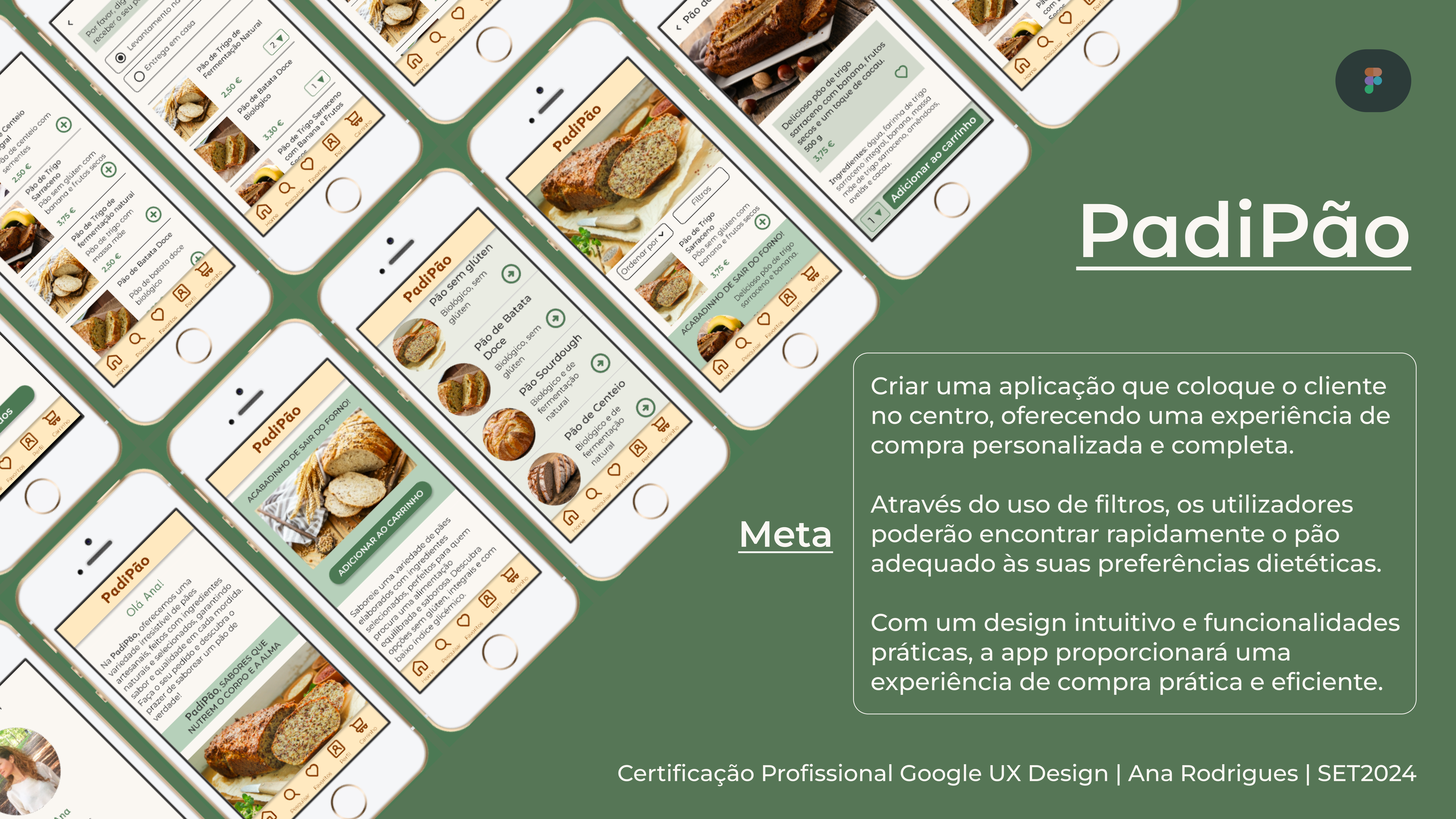
Building a responsive website that features a comprehensive library of quick, easy, and delicious vegetarian recipes. The site will include features such as searchable categories, user-friendly filters (e.g., dietary restrictions, cooking time), and high-quality images and recipe videos to inspire and guide home cooks towards a more sustainable and healthy lifestyle. The user account will offer valuable tools such as meal planning, shopping list creation, a measurement converter, and more, enhancing the user experience and simplifying the process of incorporating plant-based meals into their daily lives.
ROLE
As part of the Google UX Design Professional Certificate, I worked on all aspects of the design process, from conception to delivery.
APPROACH
This project was guided by a Design Thinking approach. I began by conducting thorough user research, including interviews, to understand their needs and challenges. This research informed the ideation phase, where I explored a variety of creative solutions. Through iterative prototyping and usability testing, I refined my designs based on user feedback, ensuring that the final product effectively addressed user needs.
RESULTS
The project resulted in a responsive website designed to simplify the lives of those seeking a healthy vegetarian diet. With quick and easy recipes, personalized filters, and tools like meal plans and shopping lists, the website offers a comprehensive and intuitive experience, perfect for busy days.


THE DESIGN THINKING PROCESS: FROM EMPATHY TO SOLUTION
By embracing the Design Thinking methodology, I prioritized understanding user needs throughout the entire process. From initial research and empathy mapping to final testing, this user-centric approach ensured that the solution effectively met their needs and expectations.
EMPATHY AND DEFINITION
I began the project by conducting thorough user research, which involved conducting interviews and developing detailed user personas. This process allowed me to deeply understand user needs and empathize with their perspectives.

PROBLEM STATEMENT
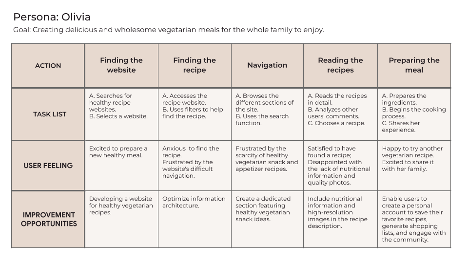
Olivia is a devoted grandmother who needs to find healthy and delicious snack ideas that her grandchildren will enjoy, because she wants them to eat healthily.
PROBLEM STATEMENT
Noah is a busy working student who needs to find healthy, simple, and easy-to-prepare vegetarian recipes because he would like to enjoy homemade, nutritious meals even on hectic weekdays.

In-depth UX research revealed that users were struggling to find healthy, quick, and easy vegetarian recipes. Detailed user journey maps highlighted the need for a more intuitive and personalized solution, such as the Eat Health website.

IDEATION AND PROTOTYPING
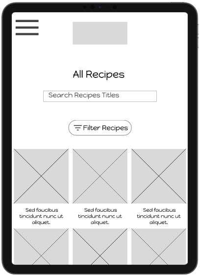
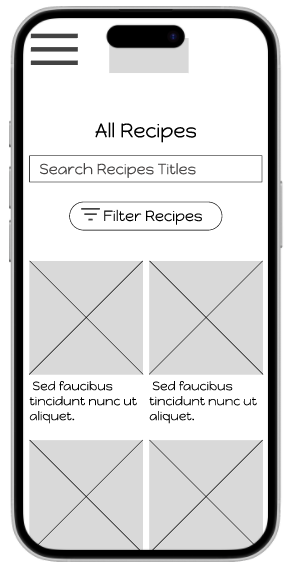
DIGITAL WIREFRAMES
To prioritize user experience, wireframe development was heavily influenced by user research findings. This ensured that the interface not only met identified needs but also provided an intuitive and enjoyable interaction.
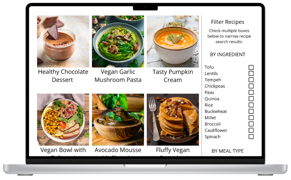
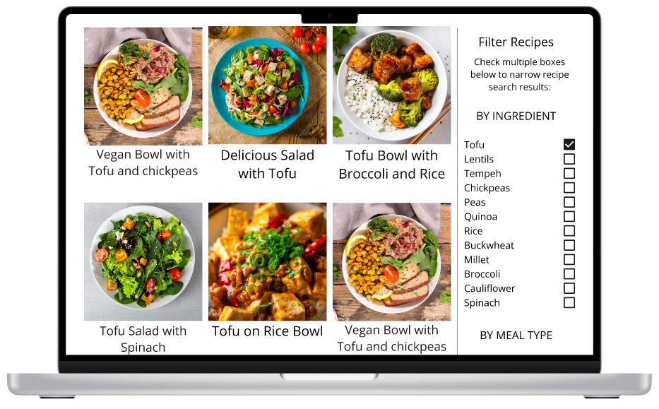
Searching is a breeze with our filters for ingredients, meal type, dietary restrictions, and preparation time.

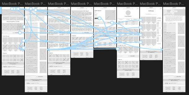
PROTOTYPES
Using low-fidelity and high-fidelity prototypes, I simulated the user journey of searching for tofu recipes. The interface, organized into categories and filters, was designed to test the efficacy of these navigation mechanisms.
Low-Fidelity Prototype
The final High-Fidelity Prototype
TESTING
The findings from the usability study were crucial in creating more intuitive and efficient wireframes and mockups. The insights gained allowed us to assess the user experience and identify areas that required design adjustments.
USABILITY STUDY: FINDINGS
- There aren't many recipe options on the homepage;
- Some participants had difficulty saving the recipe;
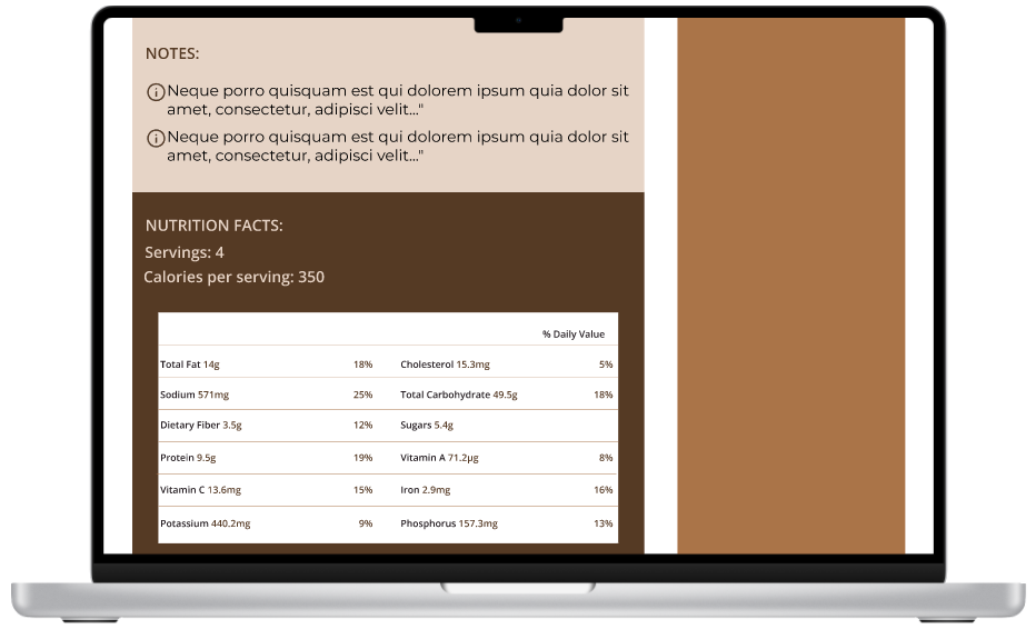
- The recipe page does not include a nutrition facts table.
MOCKUPS
Following the analysis of the usability study data, I implemented changes to the homepage to increase the visibility of recipes. This included reorganizing the visual hierarchy, highlighting recipe sections with more eye-catching visual elements, and optimizing navigation to facilitate access to desired recipes.

Before

After
To provide more nutritional information, I included a comprehensive nutrition table on the recipe page. This table offers detailed breakdowns of calories, macronutrients, and micronutrients per serving.

Before
After
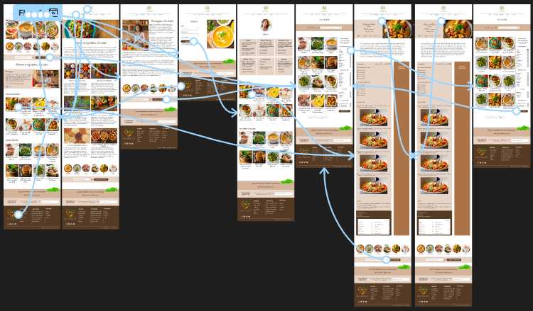
MOCKUPS: ORIGINAL SCREEN SIZE

MOCKUPS: SCREEN SIZE VARIATIONS
To provide the best possible user experience across different devices, I've incorporated various screen sizes into my mockups. These adjustments are based on my previous wireframes and aim to optimize navigation for users accessing the site from different devices.


ACCESSIBILITY CONSIDERATIONS

I ensured screen reader accessibility by including descriptive alt text for all images on every page.

I used headings with different sized text for clear visual hierarchy.

I employed the use of landmarks to enhance site navigation, particularly for users who rely on assistive technologies.
TAKEAWAYS
IMPACT
Our target users consistently praised the design's intuitive navigation. They found the visual presentation engaging, with high-quality images effectively guiding their attention. Furthermore, users readily identified the visual hierarchy, easily understanding the importance and relationships between different elements on the page.

WHAT I LEARNED
Building upon the foundational knowledge gained in my first project, I further refined my UX design skills while developing this responsive website. I explored new challenges, such as optimizing the user experience across different devices, and gained valuable experience in applying user research insights to inform design decisions at every stage of the process.
NEXT STEPS

Conduct ongoing usability studies to continuously assess the effectiveness of the solutions and identify opportunities for further iteration.

To quickly identify and fix any bugs affecting user experience.

Identify and document any unmet user needs and explore potential new features to address those needs.
I would like to express my sincere gratitude for taking the time to review my Eat Health responsive website case study.

ar@anarodrigues.me
THANK YOU!
PROJETOS


Interested in a Junior UX Designer position where I can learn and grow alongside a talented team.
Kindly contact me at ar@anarodrigues.me. Thank you!